Animation Studios
A London animation studio with strong creative work. This audit examines opportunities to improve discoverability, clarity, and the path to contact.
Current site
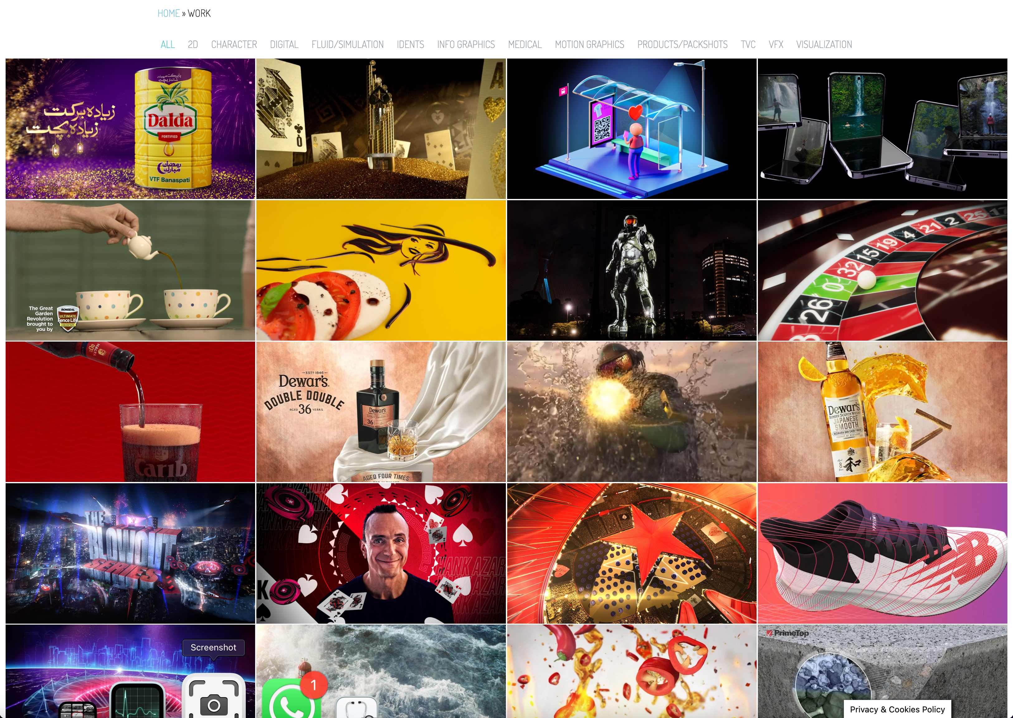
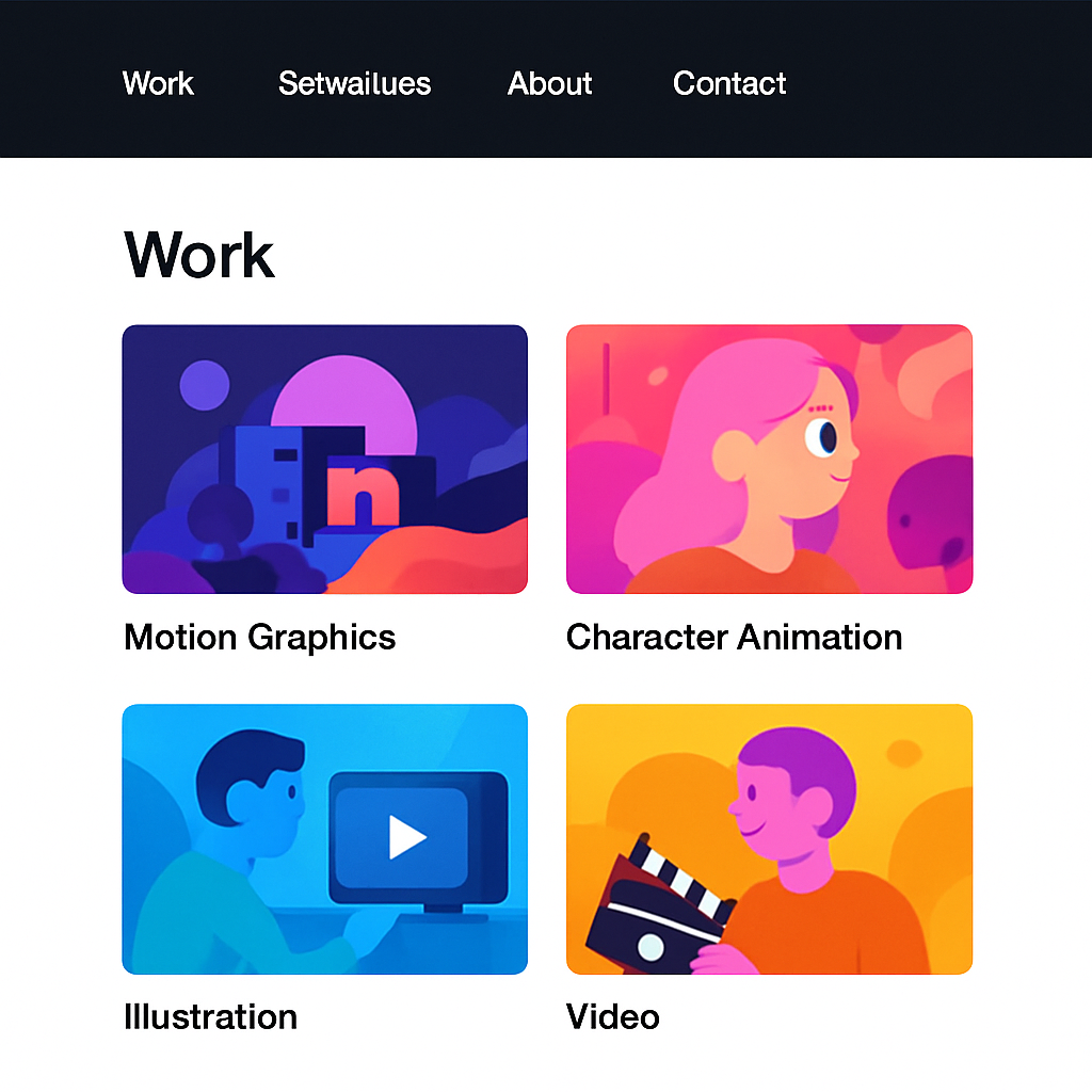
Portfolio page
Strong visual variety. The studio's best asset
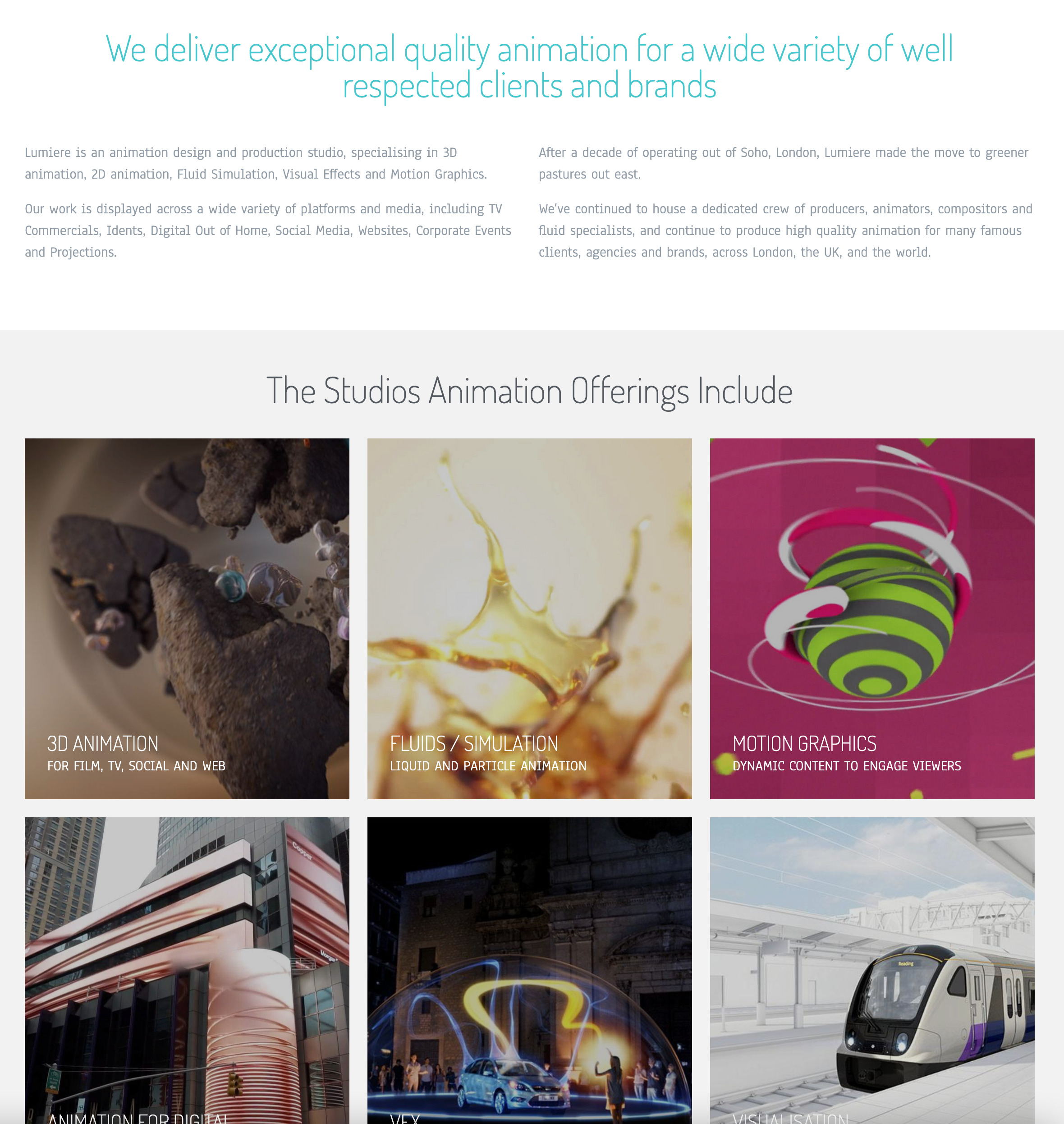
Services page
Comprehensive but potentially overwhelming to scan
The Reality
Creative agencies often lead with atmosphere and brand messaging rather than showing work. For studios where the portfolio is the primary differentiator, this approach can actually slow down the discovery process for potential clients.
“The strongest creative studios let their work do the talking. When visitors arrive, they're usually already interested. What they need is quick validation that this studio can deliver what they're looking for.”
Key observations
Work visibility
Featured projects aren't surfaced early enough in the journey. The portfolio requires scrolling or navigation to reach.
Information hierarchy
Services list is comprehensive but hard to scan quickly. Technical terms may not match how clients think.
Discovery effort
Visitors need to invest time scrolling to understand the studio's range and specialisation.
Contact friction
Budget field required before conversation begins, which creates friction for early-stage enquiries.
Work is not prioritised early enough
The homepage leads with atmosphere and messaging. The portfolio, the studio's strongest asset, requires scrolling or navigation to reach. For visitors who arrive already interested, this adds unnecessary steps.
Current approach
Headline and description first. Work is below the fold or on a separate page. Visitors must decide to explore before seeing capability.
Competitor: Buck
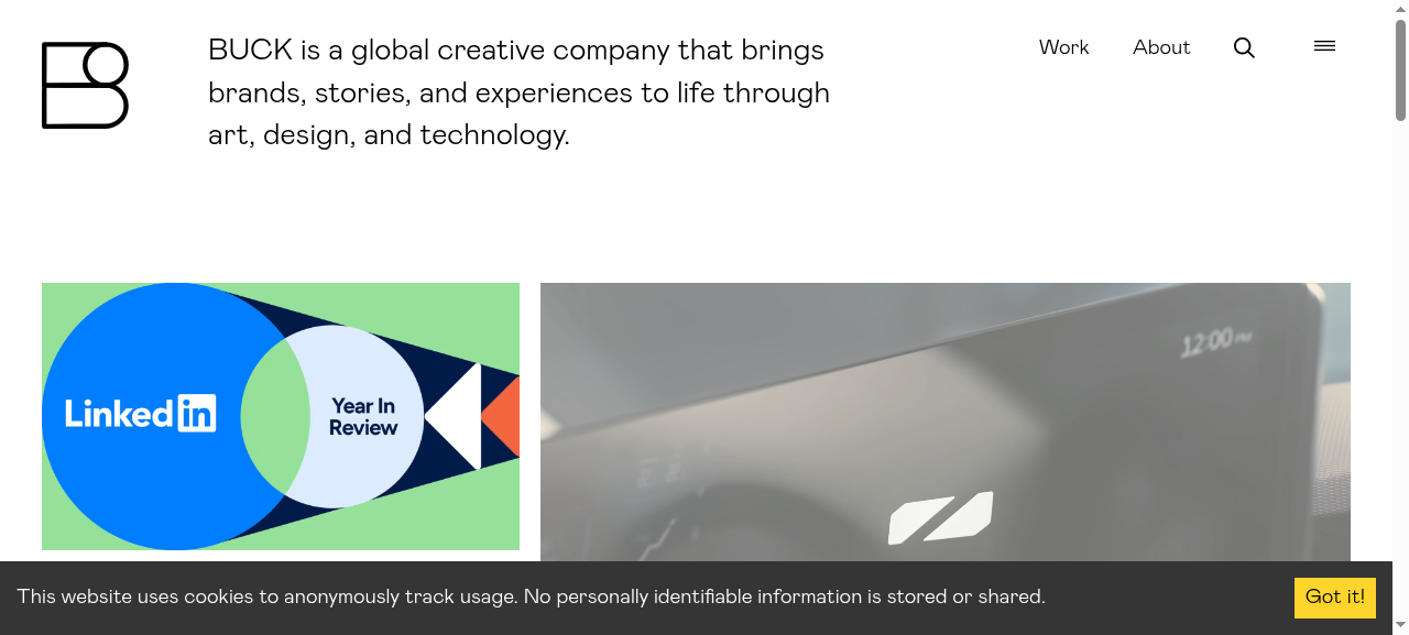
What works: Clear positioning with featured work visible immediately. Visitors understand capability within seconds without needing to click.
Strategic impact
Surfacing featured projects earlier helps visitors understand the studio's range and quality before they need to commit to exploring. This reduces bounce rate and increases engagement with the portfolio.
Information hierarchy could be clearer
The services page lists 10+ offerings. This demonstrates capability but makes it harder for visitors to quickly understand what the studio specialises in versus what they can also do.
Current services list
- 3D Animation For Film, TV, Social and Web
- Fluids / Simulation / VFX
- Motion Graphics
- Products / Packshots / Visualisation
- Holograms / Realtime / AI
- Digital / DOOH / Social
- Idents / TVC / Titles
- Healthcare / Medical
- Character Animation / 2D
- Infographics / Explainer Videos
The challenge
- !Equal weighting makes scanning difficult. Nothing stands out as a specialisation
- !Technical terms may not match how clients think about their needs
- !No visual hierarchy to guide attention toward primary strengths
Recommendation
Group services into 3-4 primary categories using client-focused language. Lead with what clients are trying to achieve, not what tools you use:
Brand Content
Stories that connect and campaigns that resonate
Product Visuals
Content that sells: packshots, visualisations, demos
Visual Effects
Technical excellence for film, TV, and advertising
“The issue isn't capability, it's communication. Visitors need to quickly answer: ‘Is this studio right for my project?’ The faster they can answer yes, the more likely they are to reach out.”
Audit observation
Navigation could reduce discovery effort
The current navigation is minimal and clean. Adding category-based filtering for work would help visitors find relevant projects faster, particularly those looking for specific types of animation.
Portfolio filters
Category filters exist (ALL, 2D, CHARACTER, etc.) but use industry terminology that may not match how clients think about their needs.
Competitor: Framestore
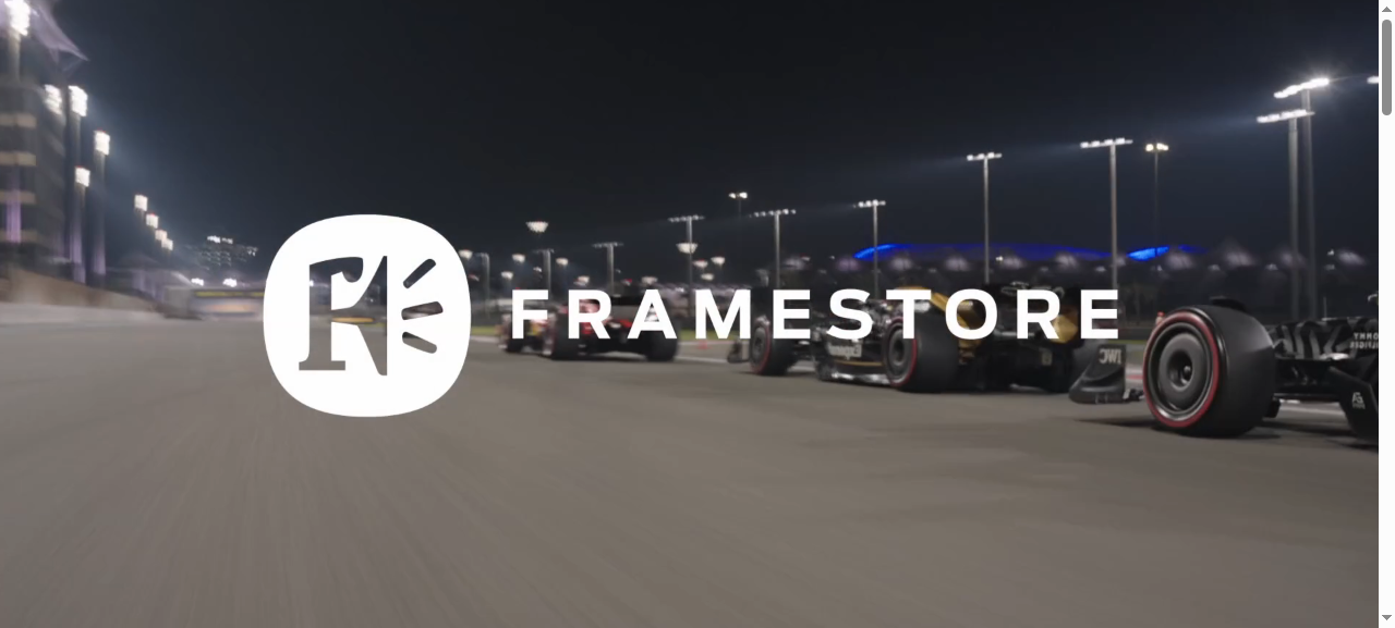
What works: Work organised by context (Film, Episodic, Advertising). Visitors can quickly find relevant work based on their project type.
Expected impact
Client-focused categories (by industry or use case) would reduce the effort needed to find relevant examples. Visitors looking for “advertising animation” shouldn't need to know if that's “2D” or “Motion Graphics” internally.
Contact form asks for commitment too early
Requiring budget information before a conversation begins can create friction for early-stage enquiries. Many potential clients are exploring options and may not have finalised budgets yet.
Current form fields
Considerations
- Budget questions work well for filtering qualified leads. Studios don't want to quote on projects that won't proceed
- Early-stage visitors may not have budget figures yet. They're exploring what's possible
- No indication of what happens after submission. When will they hear back?
Recommendation
Consider making budget optional, or add context about what to expect. A softer first touch often converts better:
Name · Email · Brief message
"We'll get back to you within a couple of days to discuss your project."
Competitor approaches
Framestore and Buck are established studios with different approaches to the same challenges. Their strategies offer useful reference points.
Framestore
Award-winning VFX and animation
- +Credentials visible: Academy Awards, BAFTAs, VES Awards
- +Work organised by context: Film, Episodic, Advertising
- +News section demonstrates active, credible studio
Buck
Global creative company
- +Clear value proposition in header
- +Featured work visible immediately on homepage
- +Clean navigation with Work and About as primary paths
These studios have different scales and audiences, but their approaches to clarity and discoverability offer useful reference points for any creative portfolio.
Summary of recommendations
Surface featured projects earlier
Help visitors see capability quickly. Let the work speak before requiring navigation.
Improve scanning with clearer grouping
Reduce services list cognitive load by organising into client-focused categories.
Use client-focused categories
Help visitors find relevant work faster by organising by project type, not technique.
Reduce contact form friction
Lower barrier for initial conversations. Budget discussions can happen after connection.
What they received
Annotated screens
Your interface with observations marked and explained in context.
Prioritised findings
Observations ranked by expected impact on clarity and conversion.
Recommendations
Practical suggestions with reasoning and expected outcomes.
Want a similar review for your product?
Get an audit that identifies opportunities for clarity, usability, and conversion with actionable recommendations you can implement immediately.
Request a UX AuditFixed scope, clear deliverables, no long-term commitment.