NCB Digital Channel Comparison
A comprehensive review of National Commercial Bank Jamaica's digital presence across website, microsites, mobile app, and physical touchpoints. This audit examines design consistency, brand alignment, and user experience across all channels.
NCB Customer Web Site
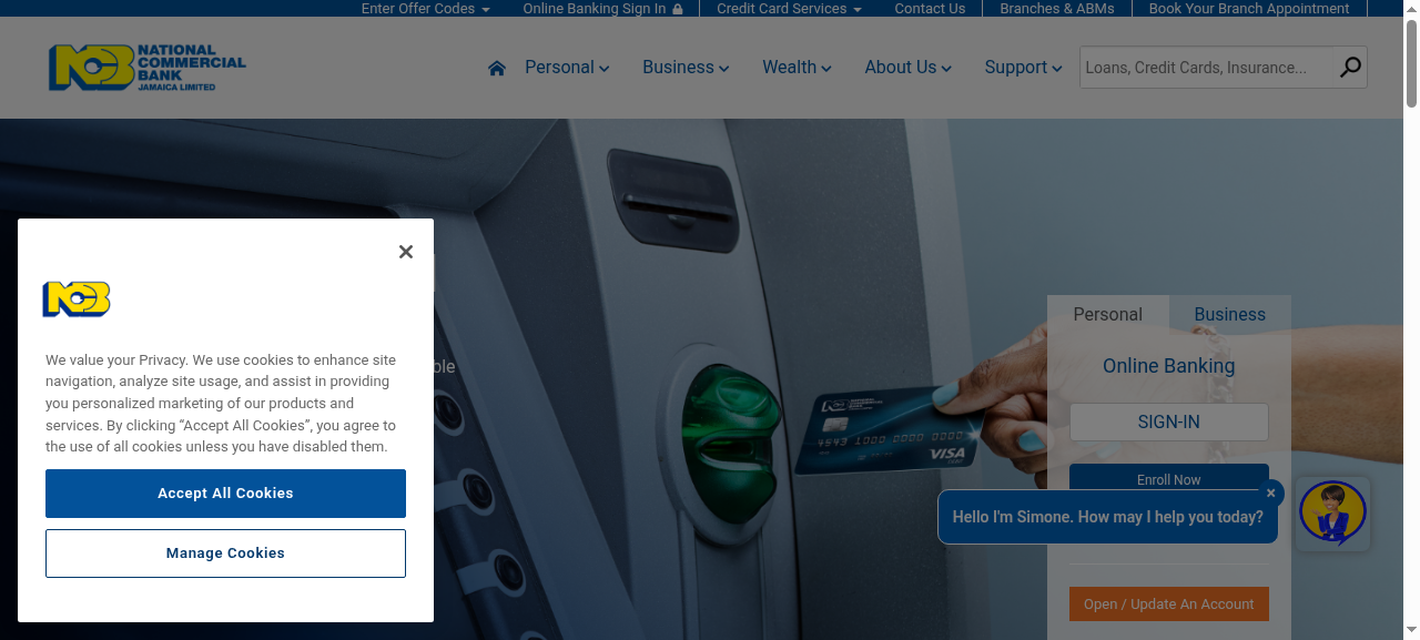
Desktop homepage
Multiple navigation menus visible simultaneously
Website Review Summary
- +Nice use of photography throughout the site
- -Multiple navigation menus all over the pages create confusion
- -Home page text over carousel images is sometimes hard to read
- -Highlighted text background blue clashes with button blue
- ?Corporate font usage unclear across channels
- -Iconography inconsistent, should be unified everywhere
The Reality
Large financial institutions often accumulate digital touchpoints over time: microsites for campaigns, apps for specific services, kiosks for branches. Without centralised design governance, each becomes a separate visual entity, eroding the sense of a unified, trustworthy brand.
“Trust in financial services is built through consistent, professional presentation. When every touchpoint looks unified and modern, users feel confident that the organisation is reliable and competent. Fragmentation creates doubt.”
Key observations
Inconsistent styling
Each microsite has different fonts, colours, buttons, and iconography, creating 11 different brand experiences.
Navigation complexity
Multiple navigation menus across pages create confusion and prevent users from building a mental model.
Readability issues
Text over carousel images is hard to read, with inconsistent background treatment across pages.
Brand dilution
Digital channels don't match the professional quality of print advertising and physical branches.
Microsite fragmentation undermines brand trust
NCB operates numerous microsites (app, paid, innovation, freedom, summer, grantawish, careers, quisk, loans, VISAGOALS), each with a completely different visual style. This inconsistency erodes the sense of a unified, trustworthy banking brand.
Issues identified
No consistent layout
Each microsite structured differently. Users can't transfer navigation knowledge
No consistent fonts
Typography varies across all microsites, fragmenting brand voice
No consistent buttons
Different button styles signal different levels of formality
No consistent iconography
Icon sets differ across touchpoints
Positive note
Some microsites are executed well: NCB Careers and the Banking App microsite look very professional and clean. These could serve as templates for standardising other microsites.
Recommendation
Create Brand Guidelines
Document fonts, colours, icons, logo usage to instill consistency and trustworthiness
Build Pattern Library
Pre-designed reusable components for consistency and faster development
NCB Microsites Reviewed
Each operating with different visual standards
“The design issue was operational rather than aesthetic. Without a central design system, every team made reasonable decisions that collectively created chaos. The solution isn't criticism, it's infrastructure.”
Audit observation
Multiple navigation menus create confusion
The main website features multiple navigation systems visible simultaneously. Users encounter different menus in different locations, making it difficult to build a mental model of the site structure.
Current experience
Top utility navigation
Contact, branches, rates, etc.
Primary navigation bar
Main product categories
Sidebar banking panel
Sign in, enroll, accounts
Footer mega-navigation
Duplicates much of the above
Recommendation
Consolidate navigation
Single primary nav with clear hierarchy
Integrate banking actions
Sign in button in header, not separate panel
Simplify footer
Essential links only, not full site map
Print advertising quality not reflected in digital
NCB's print and advertising materials show strong, consistent branding: clean white backgrounds, corporate blue and yellow, subtle grey accents, consistent typography, and the recognisable blue speech bubble device. This professional quality is not carried through to digital channels.
Print/Advertising (Strong)
- +Blue speech bubble used as standard device
- +Clean white background
- +Corporate blue and yellow, subtle grey accent
- +Consistent use of corporate font
- +Professional, trustworthy appearance
Digital channels (Inconsistent)
- -Speech bubble device not used consistently
- -Varied backgrounds, busy layouts
- -Colour clashes (highlighted blue vs button blue)
- -Font usage unclear, varies by microsite
- -Inconsistent visual language overall
Recommendation: Print and web should follow the same styles. The quality and consistency of print materials should be the benchmark for all digital channels. The investment in print design should transfer to digital.
JNGI sets the standard for digital banking presence
Jamaica National General Insurance (JNGI) demonstrates what a consistent, professional digital presence looks like. Their website builds trust through cohesive design, exactly what banking customers expect.
JNGI Strengths
- +Nice, slick look and feel throughout
- +Everything looks on-brand with a unified visual identity
- +Looks modern and professional
- +"Looks professional, I would trust my money with them"
- +Really good products page with clear overview
- +Clean design with pleasant imagery
- +Responsive mobile site
Key Takeaway
Trust in financial services is built through consistent, professional presentation. When every touchpoint looks unified and modern, users feel confident that the organisation is reliable and competent.
NCB's fragmented digital presence risks undermining the trust built by their strong print advertising and physical branch presence.
AGIC website shows similar but more severe issues
Advantage General Insurance Company (AGIC), part of the NCB group, faces more severe versions of the same consistency problems, representing an opportunity for unified improvement.
Website Issues
- Confusing mix of navigation solutions
- Bunched up content
- Badly implemented HTML
- Pointless pages with single sentences
- Blank pages
- Generally looks "dirty and messy"
App Issues
- Non-standard colours
- Non-standard iconography
- Non-standard logo as app icon
- UX issue: Estimated Value should auto-calculate
- Positive: Handy functionality
Kiosk Issues
- Non-standard colours/UI
- Yellow text on blue buttons problematic
- Extensive drop shadows and gradients
- Positive: Nice video background
- Positive: Good spacing, not cluttered
Note: AGIC does not have a responsive mobile site, while competitor JNGI does. This is a significant gap in mobile-first Jamaica where many users primarily access services via smartphone.
Strategic Recommendations
Brand Guidelines Document
Create comprehensive brand guidelines covering fonts, colours, icons, logo usage, and UI patterns. This instills consistency across all touchpoints and imbues trustworthiness to customers, which is essential for financial services.
Company-wide Pattern Library
Build pre-designed reusable components that can be used across all digital channels. This enables consistency, speeds up design and development, reduces errors, and ensures quality at scale.
User Profiles
Develop company-wide user profiles to ensure all digital products are designed with the same understanding of customer needs, behaviours, and expectations across all departments and agencies.
Design QA Process
Have designers review and QA the final developed product to ensure it aligns with approved designs. This closes the gap between design intent and implementation that often causes drift.
What they received
A complete audit package with actionable deliverables. Each document designed to enable immediate action without further interpretation.
Annotated screens
Your UI with observations marked and explained in context.
Prioritised findings
Observations ranked by expected impact on brand trust.
Recommendations
Strategic suggestions for brand consistency and trust.
Want a similar analysis for your digital channels?
Get an audit that examines consistency, brand alignment, and user experience across all your digital touchpoints.
Request a UX AuditFixed scope, clear deliverables, no long-term commitment.